What you give away is yours, what you keep is lost
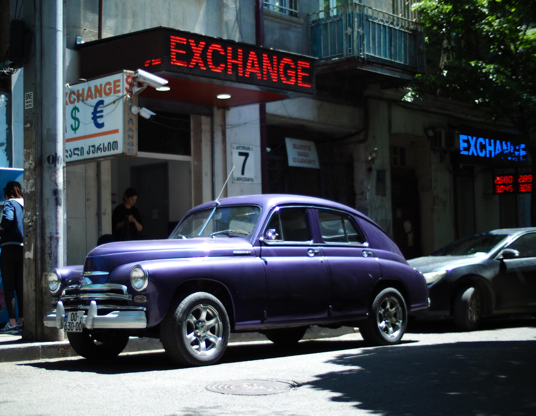
TL;DR: A purple Soviet Pobeda, a car first meant to be called Homeland, sits under three signs that all say EXCHANGE. Hard high sun behind the building, exposure set for the paint, and a blue LED sign torn into rows that gives away a very short shutter. Read with Eggleston, Shore and Rustaveli, the Georgian poet who kept a queen's treasury, it becomes a quiet picture about what we trade.
The title is a Georgian proverb, რასაცა გასცემ შენია, რაც არა დაკარგულია.
Three times the same word
You see the purple before you read anything. A deep violet car at the kerb, nose to the left, the bonnet so bright in the sun it turns almost lilac. Then your eye climbs, and the street starts to talk. Red LED letters right above the windscreen say EXCHANGE. A white lightbox on the left says it again, with a green dollar and a blue euro. And far right, a blue LED sign says it a third time, over a red board of numbers.
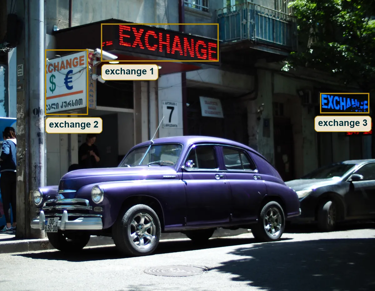
"It's better to see once than hear a hundred times," says a Russian proverb. Three signs repeat their pitch, but one purple car wins the first look. That order matters. Colour hits you first and the word comes second, and that gap is where the joke lives. An old car and one word, repeated three times like a chorus. Everything else in this essay is about how the photograph gets you to read it in that order, and what it costs to make it work in hard noon light.
A car called Victory
The body is a fastback. The roof rises over the front seats and falls in one long curve to the tail, with no step for a boot. Round headlamps sit high in the front wings, a low wide grille has a few chrome bars, and the bumper carries two tall overriders. That shape reads very strongly as a GAZ-M20 Pobeda, the Soviet car built from 1946 to 1958. The Polish FSO Warszawa used the same body under licence, so the careful reading is Pobeda family, most likely a Pobeda.
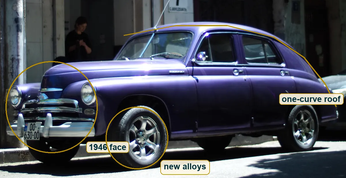
But look at the wheels. Modern multi-spoke alloys on low tyres, and you can read the tyre brand on the front sidewall. The purple is very likely not a factory colour either. Someone loves this car and made it theirs.
Pobeda means victory. Wikipedia tells the story that the car was first meant to be called Rodina, homeland, and that Stalin asked "How much does the homeland cost?" Treat it as a story, not a transcript. But put it next to this frame. A car that almost carried the name of a country, parked under three offers to price your dollars and euros. The photographer didn't write that caption. The street did, and the job was to see it.
Red plus blue
Look only at the strongest colours. A red sign above the windscreen. A blue sign on the far right. And between them a purple car. Red and blue mixed give you purple, and whether it was planned or found, the car reads as the mix of the signs around it. That's why a frame this full of stuff still feels held together.
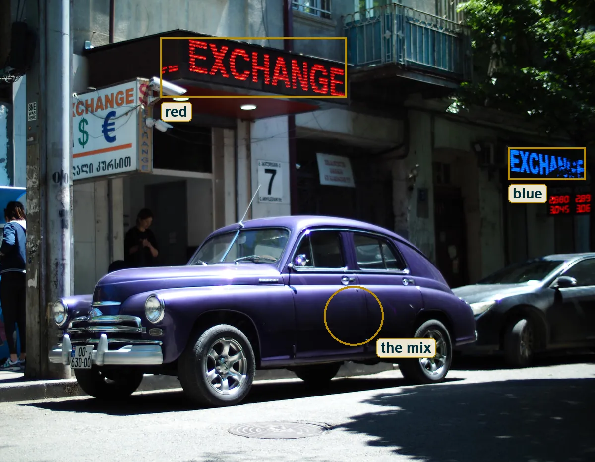
The rest of the palette stays quiet. Grey render, grey asphalt, dusty white, a little green in the tree at the top right. The white balance reads neutral to slightly cool, and in the file the sunlit bonnet comes out lilac, with more blue in it than red. The paint is the only big area of strong colour, so it wins every time your eye moves. The green dollar and the blue euro on the lightbox are small, but they repeat the cool side of the palette and stop the left edge from going dead.
The sun shines alike
Find the light by its shadows. The shadow under the car is short, nearly black, and it spills toward you and a little to the left. The bonnet top, the crowns of the wings and the edge of the roof carry the brightest highlights, while the doors fall into dark violet. So the sun is high, behind the building and a little to the right. The shop fronts face away from it and sit in their own shade.
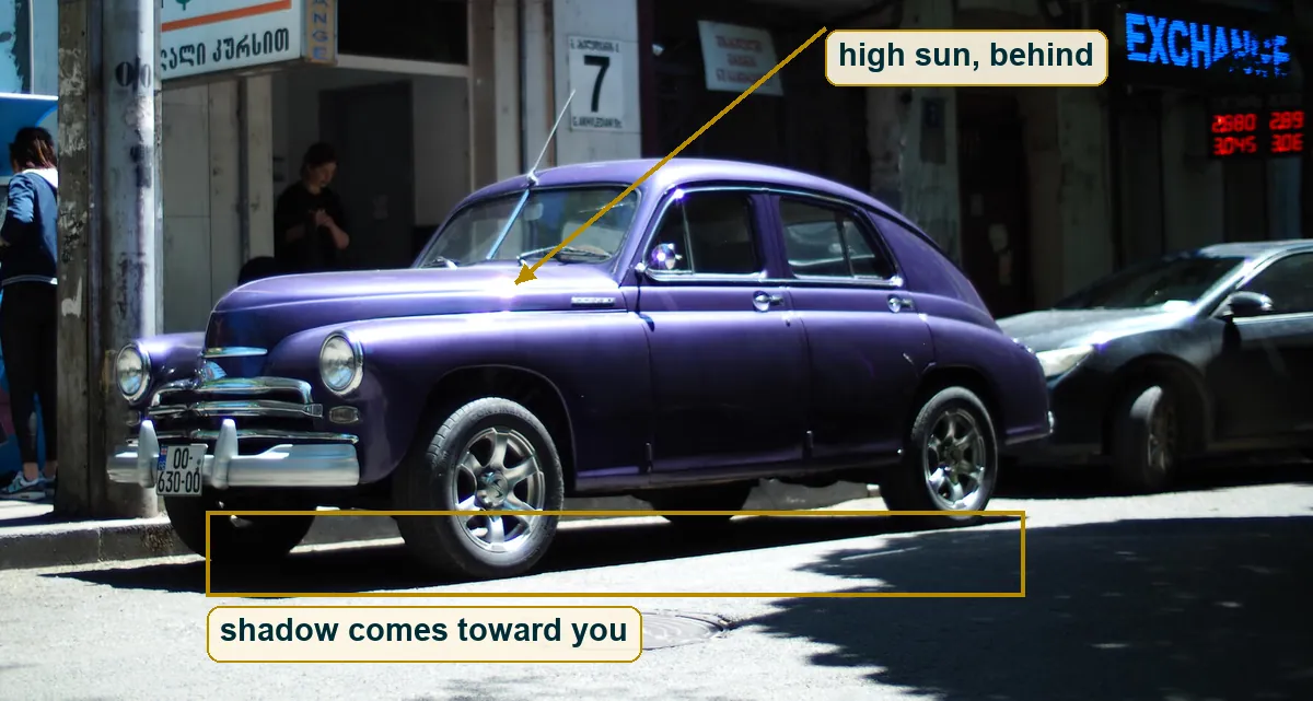
That one fact explains most of the picture. The car stands out at the kerb, far enough from the wall to be in full sun. The wall behind is in shade, and that's why the LED signs glow in daylight at all. Turn the sun around, put it behind your back, and the signs would wash out and the purple would go flat.
Rustaveli, in Marjory Wardrop's translation, has a king tell his daughter "the sun shines alike on roses and middens". That's noon light. It doesn't flatter. It hits the chrome and the cracked render and the worn pole with the same force. Midday is called bad light by people who want it to be kind. It's honest light, and it makes you choose.
Expose for the paint
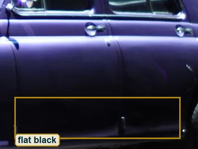
The choice here is the bonnet. In this file the sunlit road on the left averages about 232 out of 255, very close to white. The bonnet sits only about half a stop below it. The dark doorway sits around five and a half stops lower, and the lower doors of the car, in their own shade, more than seven stops lower. About one pixel in seven is close to pure black, and under two percent are clipped to white.
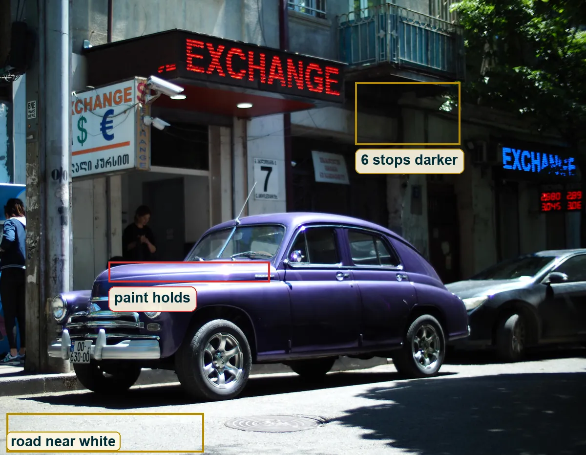
Those numbers come from a finished JPEG with a contrast curve on it, so they are not the stops of the real street. But they show what the photographer kept. The paint keeps its colour and the highlights keep a little shape. The road is allowed to go nearly white, the shade is allowed to go black. A meter set to average the whole scene would have lifted the doorways and burnt the bonnet to grey-white. Here the brightest thing that matters decides, and everything darker just follows.
The sign that broke
Now zoom into the blue sign on the right. E, X, C, H, A read clean. Then N breaks at the bottom, and G and the last E fall apart into loose rows of dots. Nothing else in the frame is torn like that.
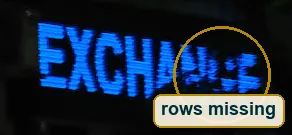
LED signs don't shine steadily. They switch their rows on and off very fast, far too fast for the eye. Most digital sensors read the image line by line too, and a mechanical focal plane shutter at high speed is also just a thin slit moving across the frame. If the exposure is shorter than the sign's cycle, each part of the sensor only sees the rows that happened to be lit at that moment. The result is exactly this, a word with holes in it.
So the broken sign is a clock. It says the exposure was very short, probably 1/500 s or faster. A dying LED module could do it too, so it's a strong hint and not proof. But nobody in the frame shows any blur either, not even a hand, and that fits.
Two signs, two clocks
The red sign above the car is whole. All eight letters are lit, with only the fine stripes of the LED rows. It was caught in the same instant as the broken blue one. The likely reason is that the two signs run on different drivers with different cycles, and the red one either refreshes faster or sat at a lucky part of its cycle.
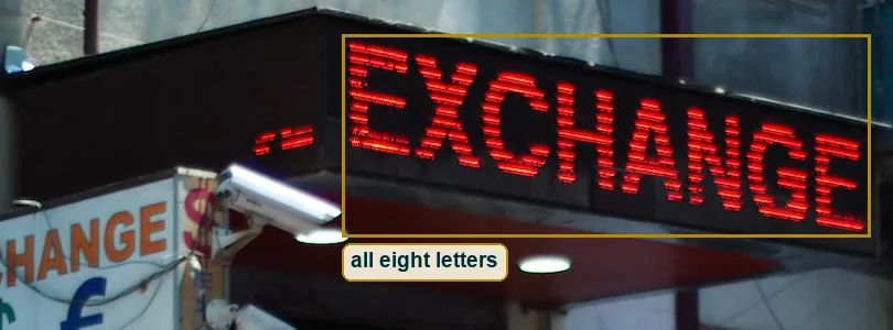
Here is the side by side. The Sunny 16 rule says bright sun at ISO 100 is f/16 at 1/100 s. My best reading of this frame is around 1/1000 s at f/5.6, ISO 100 to 200, which is about the same amount of light. Now swap it for 1/50 s at f/22. The exposure stays the same. The blue sign would almost certainly come out whole, because 1/50 s spans several of its cycles. But f/22 brings diffraction, and the whole frame goes a bit soft, and on a small sensor it gets mushy. A person walking past would smear.
And on a phone you don't get that choice. Most phone main cameras have one fixed aperture, often around f/1.5 to f/2, so in full sun they run very short times, often 1/2000 s or shorter. That's why torn LED signs turn up in phone photos all the time.
Where the camera stood
You can see the top of the bonnet, but the roof only as an edge against the wall. So the lens was above the bonnet and below the roof. The Pobeda is 1.59 metres tall, which puts the camera somewhere around 1.2 to 1.5 metres, a normal standing adult holding a camera at the chest or a phone at the face.
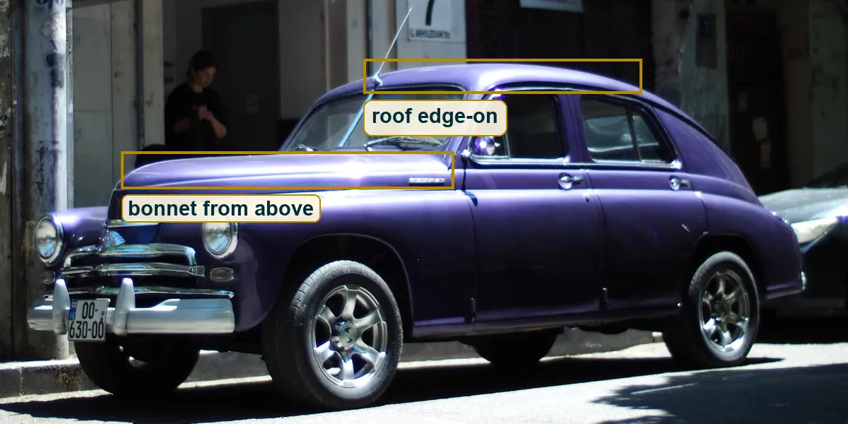
The car is about 4.7 metres long and fills roughly three quarters of the width. So the frame is around six metres wide at the car. From across a normal street, six to eight metres away, that gives a horizontal angle of about 40 to 50 degrees, which is roughly a 35 to 50 mm lens in full frame terms. A phone's main camera at around 26 mm would fit too, from closer in or with a crop. The nose isn't stretched toward you and the building isn't shrunk behind, so a wide lens up close is unlikely.
"Wolf feeds on his feet," says a Russian proverb. The camera earns its view the same way. Cross the road before changing the lens.
The picture is 1782 by 1382 pixels, about 1.29 to 1. That's a bit squarer than 4 by 3, so it was probably cropped a little.
Film or digital
Look at the smooth grey wall high up in the frame. In a flat patch the values barely move, about four levels up and down, with no grain clumps at all. The lower doors drop into black that's almost empty, the way a digital file looks after a strong curve, and not the soft long toe of colour negative.
Add the torn LED sign, which fits a sensor read line by line, and the frame that's almost 4 by 3, a common shape for phones and Micro Four Thirds. Add that the wall behind is nearly as readable as the car, which points to a small sensor or a small aperture. Add some JPEG blocks around the chrome edges. It all leans digital, and a phone is quite possible. But there's no EXIF, and a scanned slide with a hard edit could pass for much of this. Call it likely, not known.
The plain front
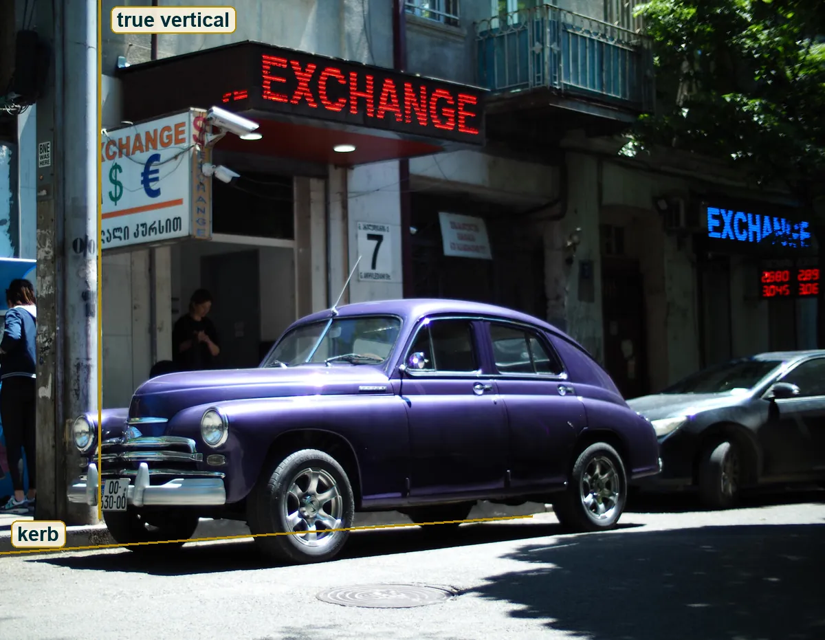
The camera is held level and square to the building. The concrete pole on the left runs straight up, and the kerb rises only a little to the right, which is perspective and not tilt. There is no clever angle. You stand in front of the thing and let it be what it is.
That calm has a history. William Eggleston's Guide came out in 1976 with a show at the Museum of Modern Art, and people called his parked cars and red ceilings banal. Stephen Shore drove across America for Uncommon Places, first with a 35 mm camera and then with an 8x10 view camera, and stood square to buildings, signs and parked cars. Both made ordinary colour on the street worth a long look. This frame is close to Shore in its straight-on patience and close to Eggleston in its love of one loud colour against a dull wall.
What they share is trust in the plain view. You don't decorate the subject. You stand where the subject says the most, and the photograph does the rest.
The poet who kept the treasury
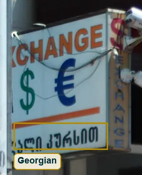
The white lightbox on the left carries a line of Georgian script under the dollar and the euro, ending in a word about the rate. It's the only place in the frame where the country speaks in its own letters.
Georgia's national poem is The Knight in the Panther's Skin, by Shota Rustaveli, more than 1600 quatrains from the Golden Age under Queen Tamar. Until the early 20th century a copy was part of every bride's dowry. Little is known for sure about his life, but the usual account says he served Tamar as a minister of finance. The country's great poet kept its money.
In the first chapter a king hands his daughter the throne and tells her how to rule. "What thou givest away is thine," he says, and then "what thou keepest is lost." She opens the treasury that same day and gives without counting.
Now look back at the frame. Three shops that live on holding and swapping currency, and in front of them a car someone could have sold for parts long ago. They kept it, and painted it a colour nobody needed. Rustaveli's line turns the street around. The thing you keep in a till is just money. The thing you give your care to becomes yours.
The one mistake
At the far left edge a person in a navy jacket stands with their back to you, facing something blue that could be a cash machine. The frame cuts them in half.
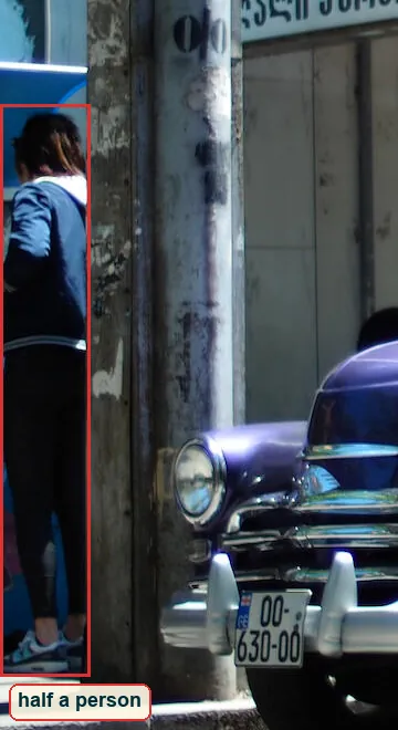
The Russian proverb says "measure seven times, cut off once", in the literal translation recorded by Wiktionary. A photograph cuts without scissors. It's a small thing, but this frame lives on clean shapes, and half a body at the edge pulls the eye out of the picture just when the pole should hold it in. The fix is cheap. One step to the right puts the pole over them, or a few seconds of waiting lets them walk out or step fully in. It costs nothing, and it's worth more than any lens upgrade.
The right side is busy too, with the dark modern car, the blue sign and the tree shadow. But that busyness is the street, and the blue sign is the third EXCHANGE. The cut person is the only thing here that's just an accident.
Try this
Put a thirds grid on this frame and you see how loose it is. The front wheel and a headlamp sit near the lower left crossing, and the red sign starts right on the left line. Nothing is forced, it just lines up.
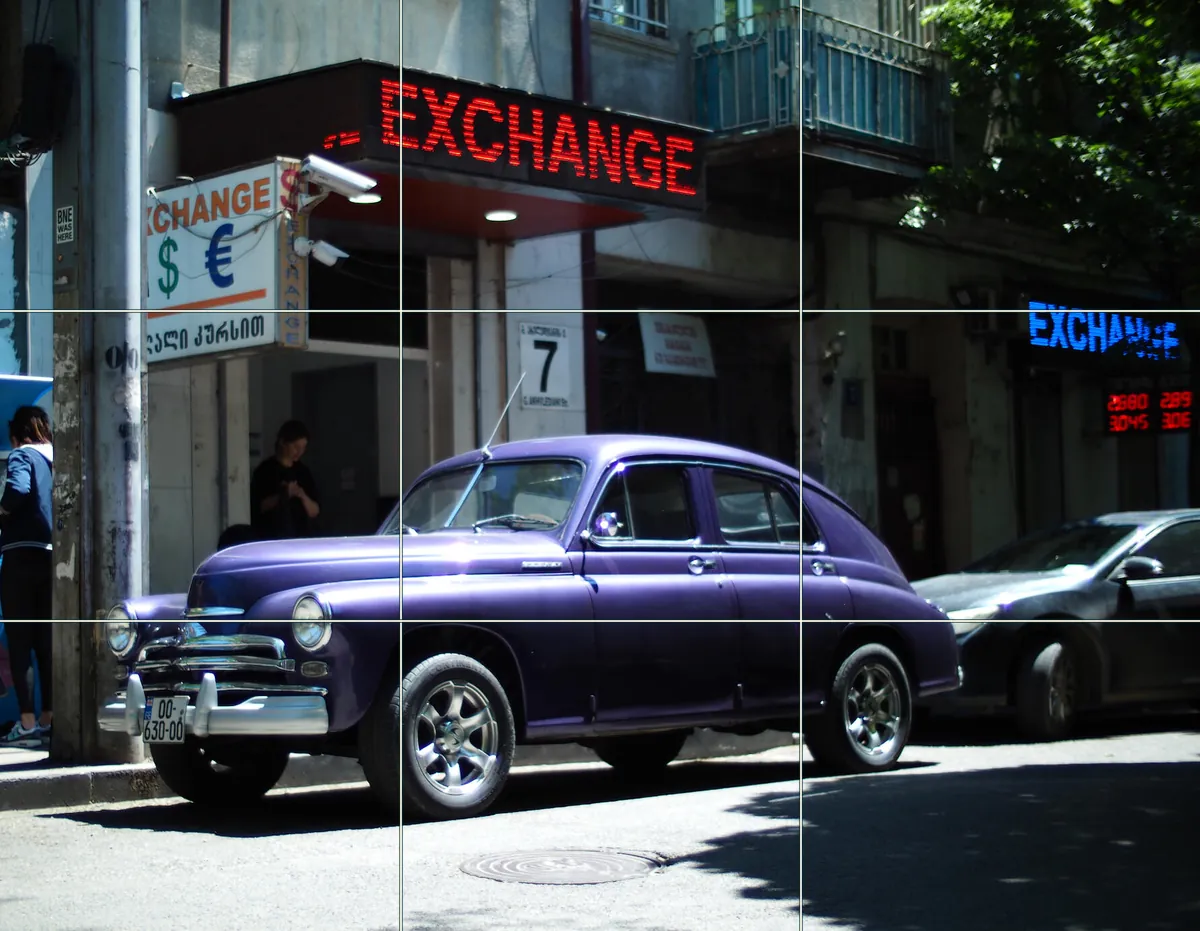
Go out at noon and walk one street for twenty minutes. Only photograph things that stand under, next to or in front of a word that comments on them. Stand square to the wall, keep the camera level, and tap the brightest thing you care about, then pull the exposure down until it holds its colour and let the shadows go black. If there's an LED sign, take one frame as it is and one at a slower shutter, and compare which version tells the better story.
Exchange
Go back to the first look. A purple car, then a word three times. Now you know the word was there before the car arrived and will be there after it leaves. The car is the part that was lucky.
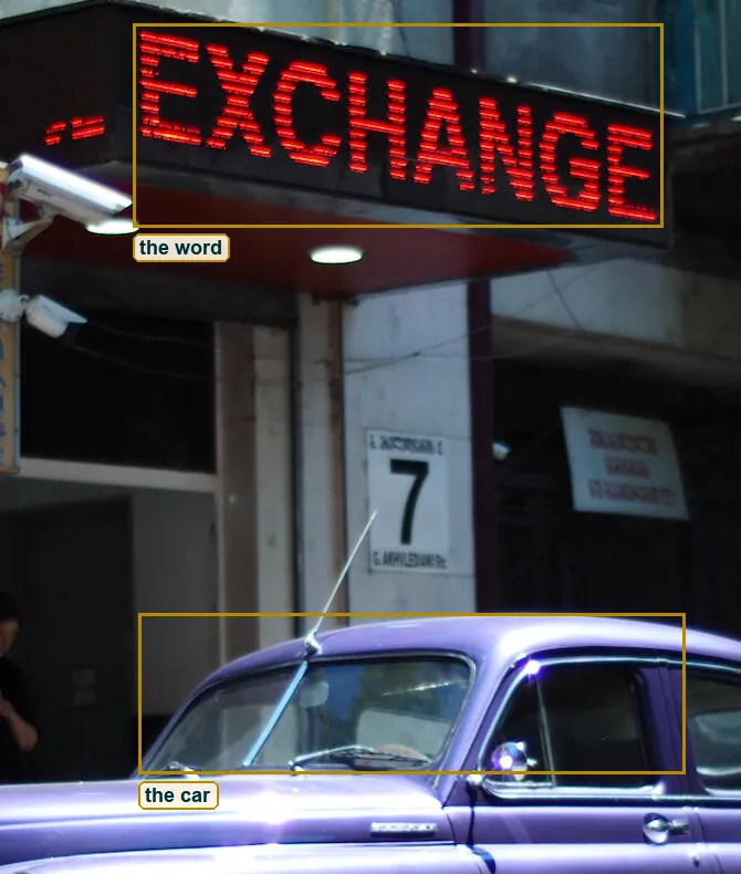
A Soviet shape named for victory, painted a colour no factory chose, on new wheels, under signs that trade dollars and euros. The light was hard, the shutter was so short it tore a sign, and the photographer kept the one thing that mattered. It's a lot of history in one parking space, and the photograph never tells you that. It just lets you swap one way of seeing for another.