A thousand friends are few, one enemy is too many
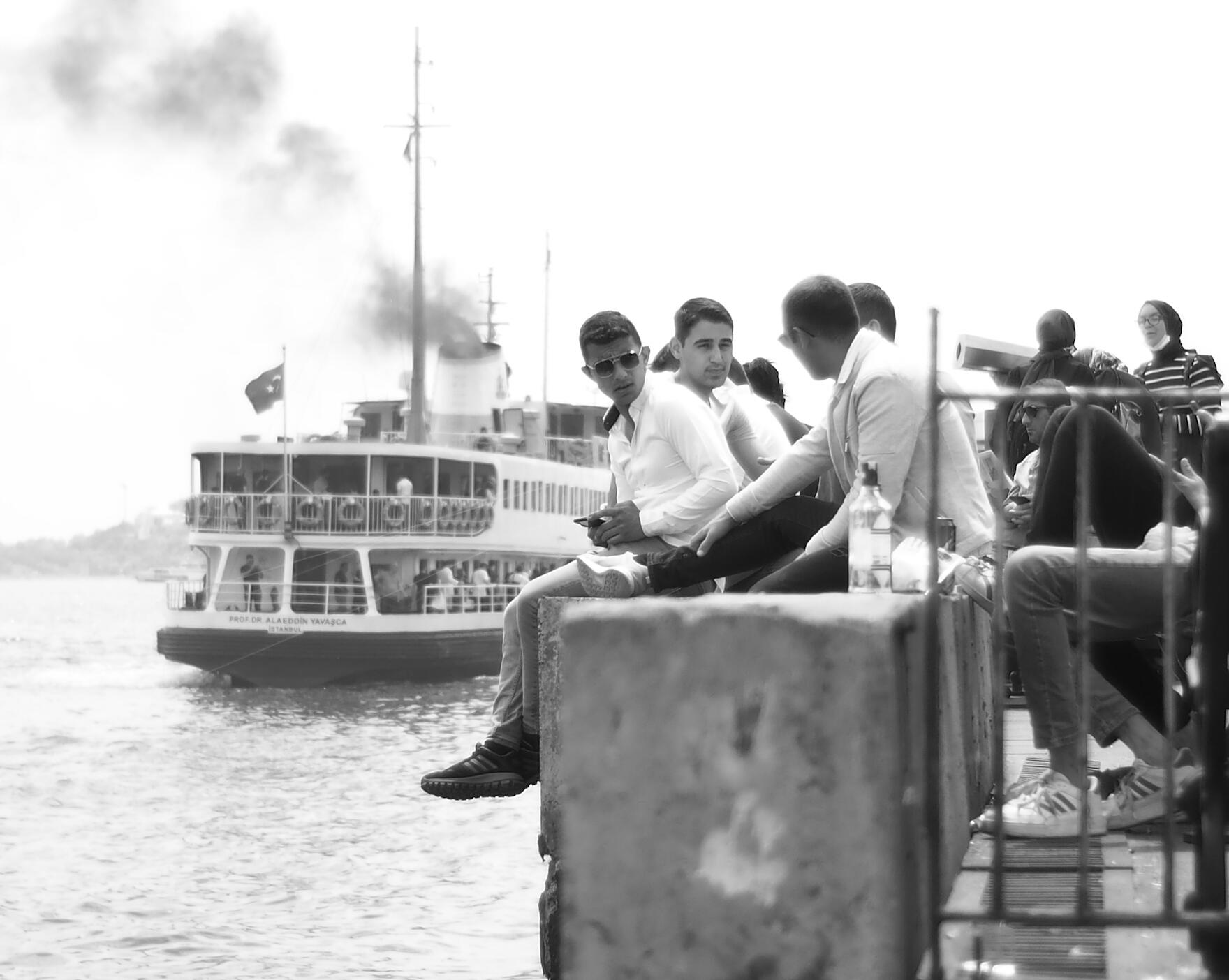
TL;DR: Young men on an Istanbul seawall are stacked against a leaving ferry by distance, and only one face turns to the camera. Every setting is read from the frame. Two head sizes give the distance, the readable stern gives about f/5.6 to f/8, the unsmeared boat gives 1/250 s or faster. The one mistake is a white shirt on a white ferry. Ara Güler, Orhan Veli, Pamuk and Hikmet show why the scene still holds.
The title is a Turkish proverb, Bin dost az, bir düşman çok.
One face turned the other way
Everyone on the wall is busy with each other. The young man in the middle looks right, toward a man in a light blazer who sits with his back to you and seems to be talking, and the blazer man looks back at him. Only one face points the other way, at the camera. It belongs to a young man in a white shirt and aviator sunglasses, phone loose at his knee, legs hanging over the water. You can't see his eyes. You only see that his face is turned to you, and that is enough.
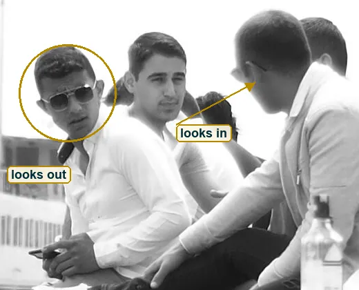
Behind him a white Istanbul ferry pulls away and black smoke climbs out of its funnel into an empty sky. That's the whole picture. A group, a boat, one look. The rest of this reading is about why those three things land in the same fraction of a second, and what you can take from that for your own pictures. The photo comes from Emin's older work on his old photo site, emino.carrd.co, and the date is unknown. There is no EXIF for this file, so every number below is an estimate, and each one comes with the thing in the photo it rests on.
A boat with a name
Look at the stern before you look at anything else. In letters about ten pixels tall it says PROF. DR. ALAEDDİN YAVAŞCA, and under it İSTANBUL. Alaeddin Yavaşca was a doctor and a composer of Turkish classical music. He studied medicine at Istanbul University, worked for decades in hospitals and left some 625 compositions when he died at 95, as Hürriyet Daily News reported. A city ferry carries his name across the water.
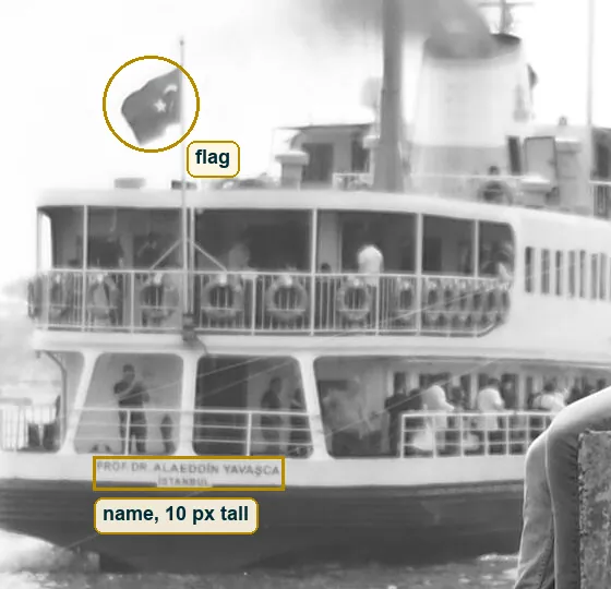
That small detail does a lot of work. It tells you this is a working boat of the city, one of the white municipal ferries with the dark hull, the life rings along the upper rail and the Turkish flag at the stern. It also gives you a ruler. Lettering you can still read tells you how sharp the far plane is, and that comes back later in the lens reading. Szarkowski named the first part of his book The Photographer's Eye "The Thing Itself". Here the thing itself is a very ordinary boat with a very specific name, and the name makes it this boat and not a symbol of boats.
Light without a sun
There are no hard shadows anywhere in the frame. Under the chins and around the eyes the faces go a little darker, and the edge of that darkness is soft, spread over many pixels. The aviator lenses show a pale gradient at the top, which is the sky, and no point of sun. That is light from a big soft source above and a little in front of the faces. Bright haze or thin high cloud, the kind a sea city gets on a humid day.
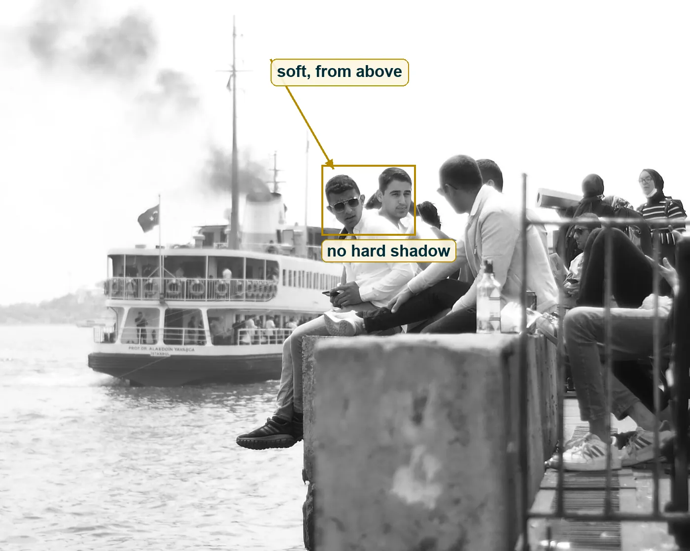
The hour is a guess, and haze makes it a weak guess. With no shadow you get no angle, and with no angle you get no time. What you do get is kind light for faces. Nobody squints, and the shirts glow but keep their folds. It's also close to the mood Orhan Pamuk wrote about in Istanbul, in Maureen Freely's translation. He calls hüzün a melancholy that is "communal rather than private", and he compares it to a steamed-up window that softens the view. The haze here does that to the far shore. It turns hills into one grey line and makes the whole frame feel a bit like memory.
White page, black ink
Measure the file and the tone gets strange. About a quarter of all pixels are pure white, the full 255, and in the top third of the frame it is almost three quarters. Less than two percent of the picture is near black. Those few dark points sit in small places, the sunglasses lenses, the dangling sneakers, the blazer man's trousers.
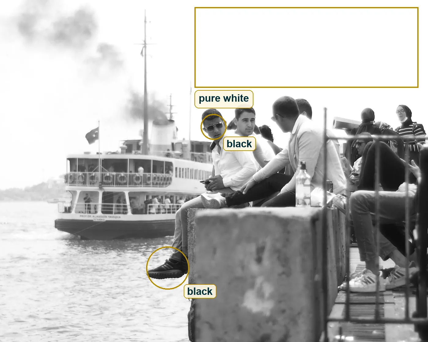
This is a high-key print, and it works like a sheet of paper with a little ink on it. Your eye goes to the ink. The smoke is not even black, its densest part is a mid grey, but on a white page it reads as the darkest thing in the sky. The cost is that the sky has no texture at all, and that white shirts and a white boat sit on the same value. A darker print, the whole curve pulled down half a stop, would give the sky some grey and the shirts an edge. It would also make the picture heavier and less like summer. That's a real choice, not a mistake.
Where the lines fall
The geometry is tidier than the scene. The ferry's main mast stands at about 34 percent of the width, ten pixels right of the left third line. The row of heads rides the upper third line. The horizon, a soft grey shore on the left, sits at about 57 percent of the height, a little below the middle. And the smoke draws one long diagonal from the funnel to the top left corner.
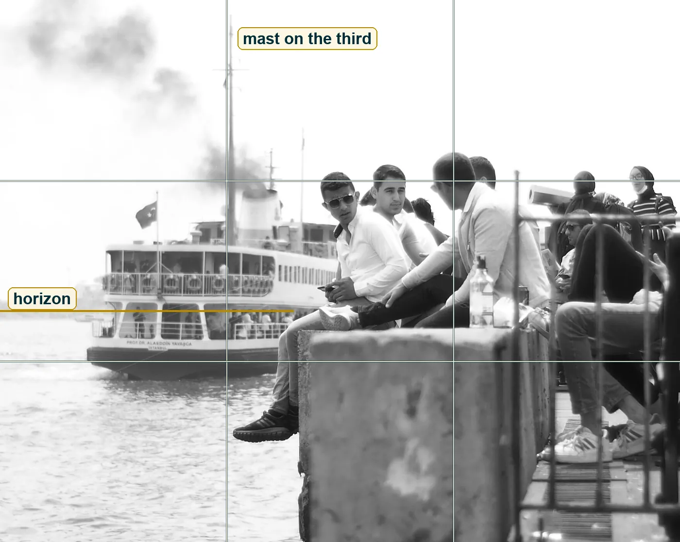
The weight is not balanced, and that looks right. The right part is full of bodies, railing bars, a water bottle and more people behind the rail. The left part is open water and sky with one boat in it. A crowded human side looks across at an empty side, and the one face that turns out sits right on the seam where the ferry ends and the crowd begins. The right edge cuts several people in half and keeps the ferry whole. That is where the decision went.
Two heads and a ruler
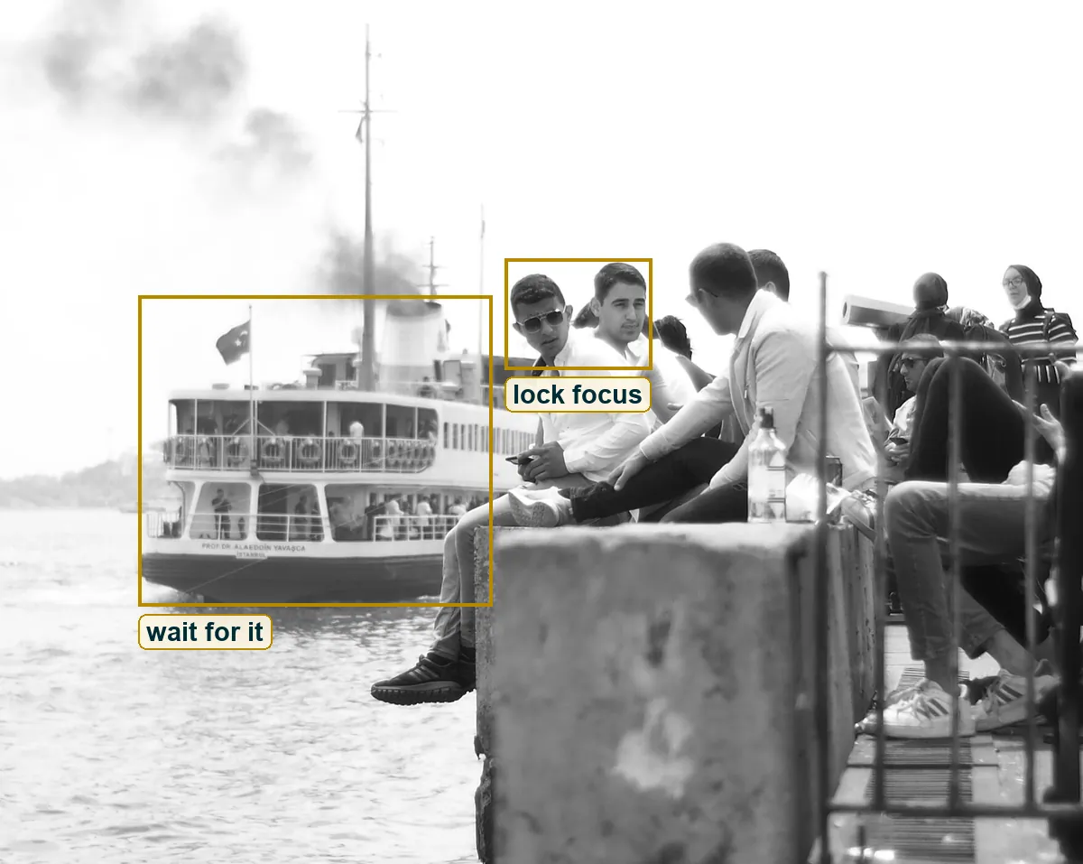
Here is the cleanest way to read the lens. The aviator man's head is about 133 pixels tall. A passenger standing in the ferry's lower deck has a head about 14 pixels tall. Real heads are about the same size, so the passenger is roughly nine to ten times farther from the camera than the man on the wall. If the lens was about 50mm in full-frame terms, the man sat about five metres away and the ferry was about 47 metres out. With 100mm, double both.
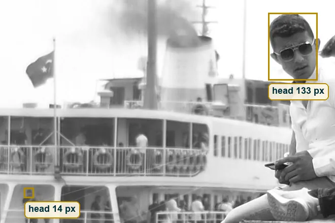
Now the part most people get wrong. That ratio is distance, not focal length. A longer lens only crops, it doesn't change how big the far thing is next to the near thing. What changes it is where you stand. Shoot the same man at the same size with a 28mm and you have to stand about half as far away or closer. The ratio jumps from about 9 to somewhere between 16 and 31, the passenger's head drops to 4 to 8 pixels and the ferry turns into a toy on the water. Stand back the way this photographer did and the boat looks moored to his shoulder. That stacked look is called compression, and it lives in your feet. The focal length stays a range, something from a normal lens to a short tele, or a phone's 2x or 3x module.
Sharp, readable, soft
Three distances give three kinds of sharpness. The dark sneakers hanging over the water are crisp, and you can see the ridges on the sole. The ferry name, about ten times farther away, is soft but readable. The near face of the concrete block, right in front of the lens, has melted into grey blotches with no edge at all.
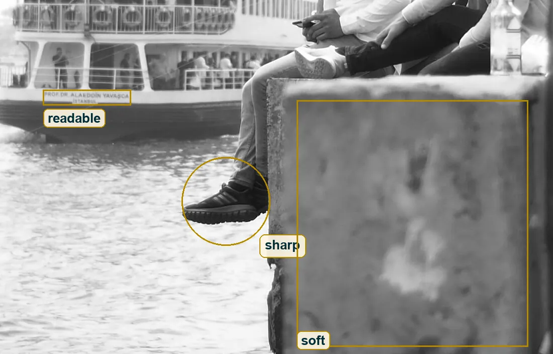
That spread tells you the aperture better than any guess about the camera. Wide open at f/2 with a 50mm, the blur on the ferry would be about 13 pixels, bigger than its 10 pixel letters, and the name would be gone. At f/8 the blur shrinks to about 3 to 7 pixels depending on the lens, and the name survives as a soft line, which is what you see. The block is so close that even f/8 can't hold it. So f/5.6 to f/8 fits best. Put the two side by side and the trade is plain. f/2 gives you a dreamy boat shape and loses the name, and f/8 keeps the name and gives up nothing you'd miss.
The smoke sets the clock
Ferry funnels don't smoke like this all the time. A thick plume usually comes when the engine works hard, like when a boat has just left the pier and is picking up speed. Near the funnel the smoke is still dense and tight. At the top left it already breaks into soft puffs. A few seconds later it would be a grey smear over the whole sky, and the picture would lose its one dark line.
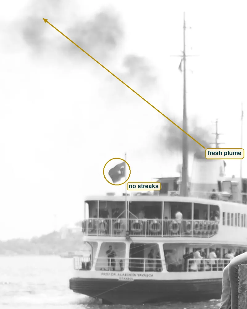
Inside that window the shutter had to be quick enough. Nothing shows a streak in one direction. The flag is soft but not dragged, the phone hand is still and the wave glints are short. Now do the numbers with the distances from above. Say the ferry moves at about 4 metres per second, a slow start. Seen through a 50mm from 47 metres, it crosses about half a pixel of this file in 1/500 s and about one pixel in 1/250 s. At 1/30 s it would cross about 8 pixels, close to the height of its own name, and the stern would smear. So 1/250 s or faster, likely somewhere up to 1/1000.
The light agrees. The sunny 16 rule says full sun at ISO 100 is about f/16 at 1/100 s. Bright haze is roughly one stop less, which gives f/8 at 1/250 s or f/5.6 at 1/500 s, both inside the estimate. At 1/500 s the ferry travels only half a pixel. The exposure is short enough that the glance and the fresh smoke both fit in it, yet it still records movement rather than abolishing it.
Film or digital
The clues point to digital. Grain shows in mid greys, not in white, because blown white has nothing left to show. So don't test the sky here, it's pure 255 and tells you nothing. Test the smoke. In a full size crop its greys roll smoothly from light to darker with no speckle, and even fine film would leave some tooth in that grey. The concrete looks smoothed too, the way noise reduction smooths things.
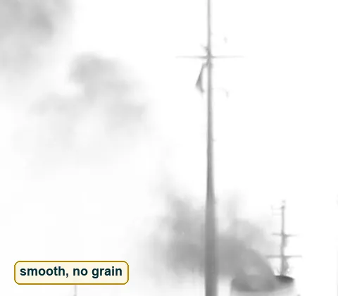
The same clean greys say something about ISO. With this much daylight there was no reason to push it, so a low setting around 100 to 200 is likely, or a higher one cleaned up hard in the edit. Two more clues. Every pixel in the file has the same red, green and blue value, so it's a grey file made from something else, and you can't see what the camera first recorded. And the frame is 1760 by 1404 pixels, almost exactly 5 by 4. Most cameras shoot 3 by 2 and most phones 4 by 3, so 5 by 4 is usually a crop someone chose later. The likely story is a digital colour file, cropped and turned black and white in the edit. Likely, not proven. A clean film scan with heavy noise reduction could look the same.
Ara Güler and the smoke of ships
Any black-and-white Istanbul ferry calls up one name. Ara Güler, known as the eye of Istanbul, spent his career on his home city, and Cartier-Bresson invited him into Magnum. His Guardian obituary says that in his pictures from the 1950s and 1960s "the mosques, the water and smoke from the ships insistently recur". Pamuk wrote in the foreword to the book of those pictures, "Ara Güler's Istanbul is my Istanbul."
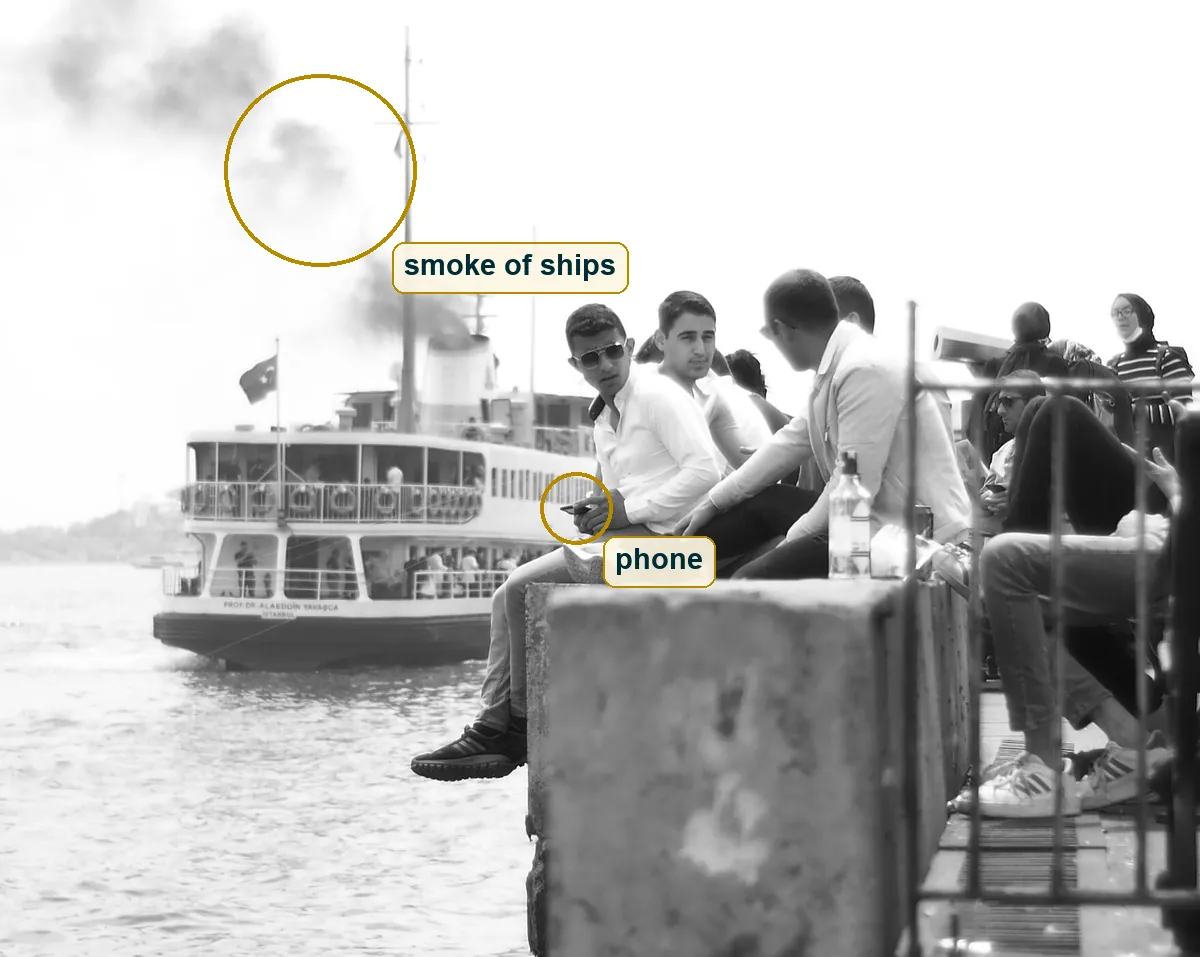
So the link holds on the subject. Water, a ferry, smoke, people at the edge of the city. Güler also said colour lacks the solidity of black and white, and this picture leans on that same solidity. But it isn't an echo of him. His best known Istanbul is darker and heavier, and it often shows the hard side of life. This frame is light and clean, stacked by distance and full of leisure. A phone, a water bottle, sneakers, a blazer. Think of it as a grandchild of that tradition, with the same smoke of ships seen with a lighter hand and in a later decade.
Orhan Veli and the fine days
Orhan Veli was born in Istanbul in 1914 and wrote short poems about ordinary days. One of his Istanbul poems, in Talat Sait Halman's translation, keeps coming back to one line, "I am listening to Istanbul, intent, my eyes closed". This photo is the reverse. It is Istanbul with the eyes open and the sound gone, no engine, no talk, no gulls.
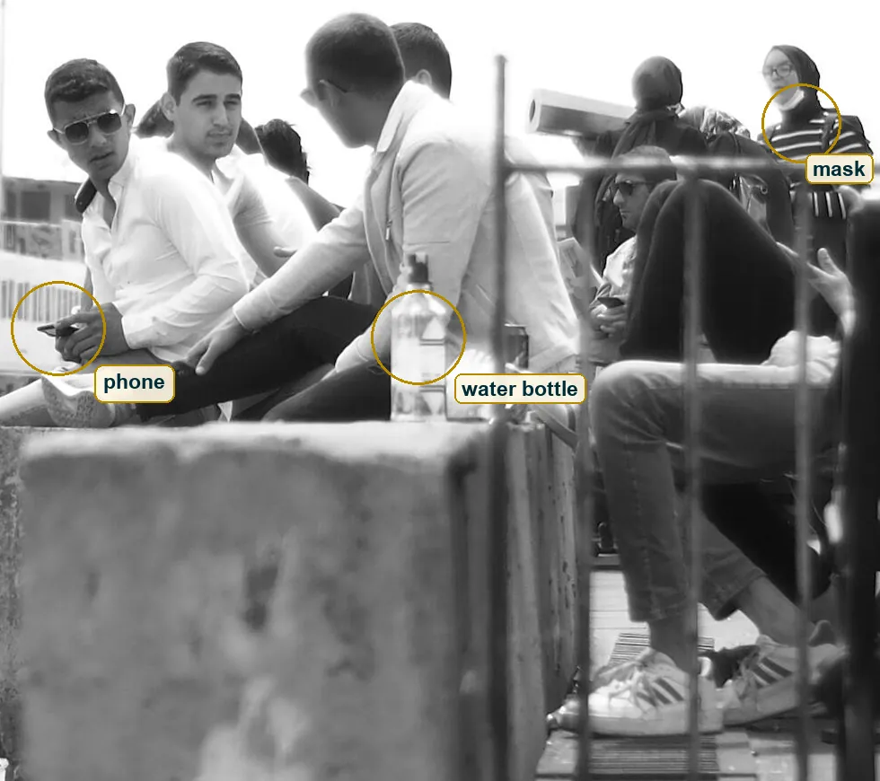
Another poem of his fits even better. In Bernard Lewis's translation, Fine Days lists what good weather did to the speaker. He quit his job, he started to smoke, and "On this kind of day I fell in love". That is this wall. Friends with nowhere to be, a bright day, a water bottle on the concrete and a mask pulled down to a chin on the right, which hints at the 2020s but gives no date. And in There Must Be Something he asks, "Is the sea as beautiful as this every day?" You can ask the same of this picture. Probably not. It needed this haze, this boat and this one look.
The one mistake
The white shirt of the man who looks out sits right on the white upper deck of the ferry. Along his sleeve, between the dark strap at his shoulder and the phone hand, shirt and boat have almost the same grey, around 205 to 215 out of 255. There's no edge. His figure looks pasted onto the boat instead of standing in front of it.
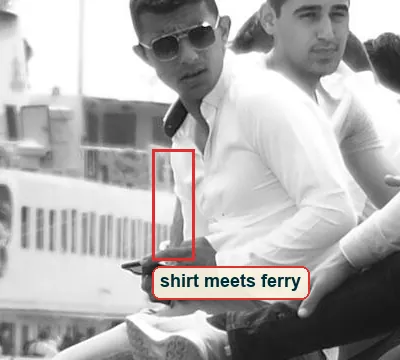
The fix at the scene is a habit. Before you press, check what sits behind every white edge, and if it's white too, move until something darker sits there. With a moving boat that can be one step and two seconds. The fix in the edit is smaller. Burn the ferry down by half a stop and it drops from about 205 to about 175, while the shirt stays near 215, and the man comes forward off the boat. It's one mistake, and it costs more than any lens upgrade would give back.
Try this
Go to a pier or a bus stop with a timetable and sit a friend on a wall in the near ground. Step back until their head fills about a tenth of your frame height, use the 2x or 3x lens on a phone, lock focus on the face and pull exposure down a third of a stop. Wait for the boat or the bus to arrive behind them and shoot a burst. Then check every white edge, and if white sits on white, take one step and shoot again.
Why it stays
What stays is the double time. The ferry is an old Istanbul form, a white boat with a dark hull and a flag, crossing water that these boats have crossed for generations. The young men are all present tense, phones, sneakers, a blazer, sunglasses. Distance presses both into one plane, so the old city leaves in the back while the new one sits on the wall and talks.
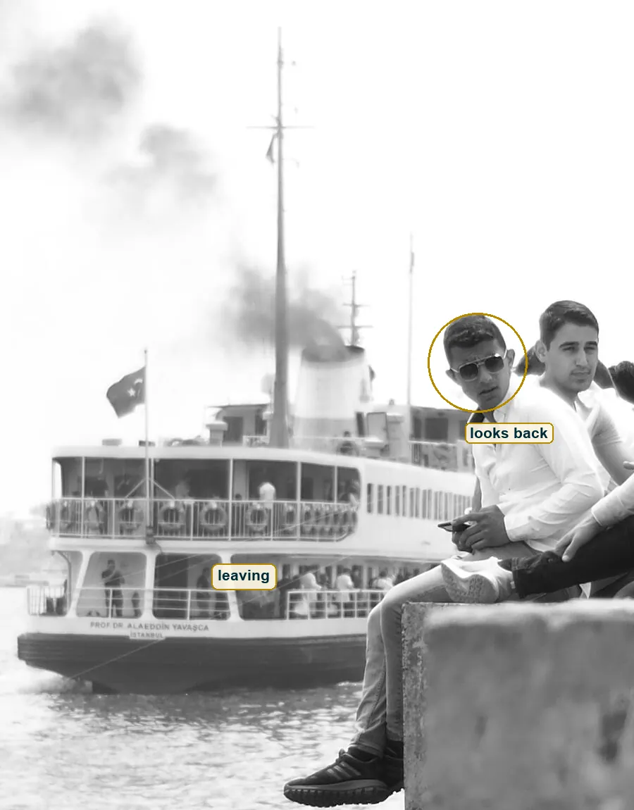
And in that present tense one person looks up. He doesn't wave and he doesn't pose. He just turns his face to the camera, and you end up on the wall with him, watching the boat go. Nazim Hikmet's On Living, in the translation by Randy Blasing and Mutlu Konuk, opens with "Living is no laughing matter". This picture takes that seriously in a small way. A boat, some smoke, friends on concrete, looked at long enough to keep.